How to implement percent in gradient bar in React
In this article, we'll be creating a gradient bar that will show the percentage in React. There might be many packages that will be helpful in this scenario but the fun is when you can make it work from scratch. So let's begin.
Here is the demo link.
Challenge
Creating a bar is easy unless there are no segments. But since we are creating a segmented bar, we need to take care of segments beforehand.
For this, we need a variable to store the number of segments. Let's say
const BAR_COUNT = 7;
We are assuming there will be 7 segments of the bar but you can make more segments. The only constraint here is the color of each segment because for now, the 7 colors are hard-coded.
Initialization
So a full bar is 100%. But since we have segments we also have to know how much percent will a segment hold. To determine this we can divide 100% by the total number of segments.
const quartilePercentage = 100 / BAR_COUNT;
Since we have 7 segments, the percentage each bar will hold is 14.28%
100 / 7 = 14.28
This percentage will be handy when filling the bar with color later.
And since we need an actual percentage to show on the bar, we will pass them as props.
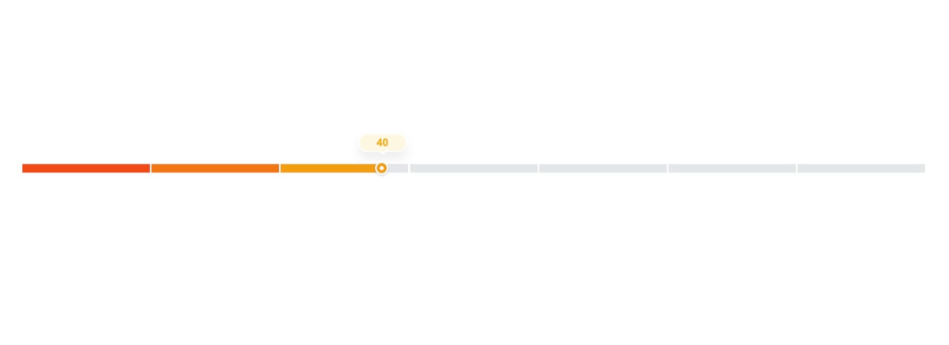
<GradientPercentBar percent={40} />
We will use this percentage and assign it to a variable inside the component which will restrict the percentage to be maximum of 100.
const truePercent = percent > 100 ? 100 : percent < 0 ? 0 : percent;
We will also want to know where the percentage will fall and based on that we will assign a color. To figure out whether the label will be low, medium or high, we will divide the truePercent with the quartilePercentage we initialize earlier.
If truePercent = 40, the barIndicator will be 40/14.28 = 2.80 ~ 3.
Thus the potentialLabel is medium. So the bar will fall on 3rd segment
const barIndicator = Math.round(truePercent / quartilePercentage);

const potentialLabel = barIndicator < 3 ? 'low' : barIndicator <= 5 ? 'medium' : 'high';
Indicator
We will create a simple indicator that will render the true percentage and the class will depend on the potentialLabel. We will get back to this function in a while.
  const renderTooltip = useCallback(
    (potential: string) => {
      return (
        <div className={`indicator ${potential}`}>
          <span>{truePercent}</span>
        </div>
      );
    },
    [truePercent]
  );
Magic Function
This function will be responsible for creating the bar hence the magic function.
Some variables initialization that we will be needing later.
let elementArr = [];
let root = document.documentElement;
let percent;
let quartileValue;
We will now loop through BAR_COUNT with starting index of 1 and with each iteration, we will assign the range of each bar.
const currentPoint = Math.round(quartilePercentage * i);
This will provide us with the value each bar will have. For example
In 1st iteration, i = 1 and (1 * 14.28) ~= 14
In 2nd iteration, i =2 and (2* 14.28) ~= 29
..
..
In 7th iteration, i = 7 and (7 * 14.28) ~= 100
In this example, we have our truePercent value of 40, so all the bars below 40 should be filled. This will be done by pushing the element elementArr array.
elementArr.push(<div className='item filled' key={i} />);
But all the points above will have further calculations to determine what elements to push in elementArr.
Now we calculate the percentage that will be used to fill the bar with gradient color. If you are not familiar with CSS, we can use background-image to generate a linear effect to show half filled and half-empty.
 const previousPoint = Math.round(quartilePercentage * (i - 1));

 const difference = currentPoint - previousPoint;

 percent = `${Math.round(((truePercent - previousPoint) / difference) * 100)}%`;
We know that the truePercent lies in 3rd segment. But it will not fill to 3rd segment. Some of them will be half empty. Thus the above calculation comes in handy.
The above percentage will be
((40- 29)/14) * 100 = 78.57 ~= 79
This means the color will be filled up to 79% of 3rd segment and the rest will be white.
Now we have all the values required to implement the bar, we just need to push it into elementArr.
 elementArr.push(
        <div className={`item ${i === quartileValue ? 'current filled'               : ''}`} key={i}>
            {i === quartileValue && renderTooltip(potentialLabel)}
          </div>
 );
After all the iterations, the elements will be pushed into elementArr.
Some code looks like this.
root.style.setProperty(`--block-${i}`, percent);
root.style.setProperty(`--left-value`, percent);
These are used to set CSS variables that will be used CSS.
The --block-${i} is used in linear gradient while the --left-value is used to indicate how far the indicator is from the block.
Final Structure
The return function for the bar component is simple. It will call rangeArray function which will be responsible for generating the bar.
    <div className='App'>
      <div className='potential__range'>
        <div className='range'>{rangeArray}</div>
      </div>
    </div>
There is further CSS required to color the bar but the major functionality for the bar is done.
Hope this tutorial will be useful for some of you.